
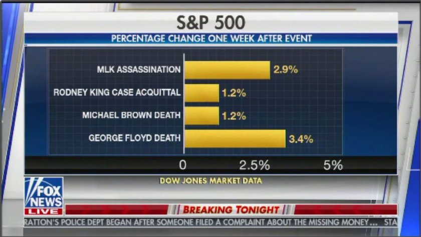
Take a look at this bar chart. Note the Y-axis: historic instances of black death and racial injustice. Look at the X-axis: a measurement of stock market growth. Then ask yourself, what is the point of taking this measurement?
In my work in financial services, I’m accustomed to seeing charts like this. They’re created and marketed to reassure investors, both wealthy one-percenters and retirement plan participants like you and me. These illustrations take distressing historic events and use them to tell the story that your savings are safe from distressing current events. That’s what Fox News is uplifting here. Worse yet – they’re telling a story that this most recent instance of public black death is even better for you financially.
An unstated, but fundamental, implication in these types of graphs is that you the reader are completely dissociated from calamity. So when you gauge the impact of past recessions, or wars, or pandemics, crises that seem too massive to control, you can feel confident that you won’t lose your money. Fox is banking on that perception here – that you have no relationship to black trauma, so relax, there’s good news!
But the events along the Y-axis aren‘t sweeping, global crises. They’re discreet junctures, intimate, personal moments in which individuals made choices to perpetuate racial injustice and black death. We have a choice, too: to speak out and act up against racist violence, or to ease back into our comfortable surroundings, secure in our own financial foundation, insulated from the insecurities that plague our neighbors. Which will profit you more in the long run?
